Behind Closed Doors
A renovation to a previously dysfunctional townhouse was inspired by ideas of integration and concealment. California-based clients wanted to transform the homes dark, enclosed, disparate spaces into something more open, connected, and loft-like. A place suitable for quiet nights but also busy evenings entertaining with friends.
Herne Bay, Auckland
New ZealandIntegration became central to the conceptual framework of the space. It was about finding a rhythm through the house and introducing a consistent language. The timber cabinetry became a visual link that encompassed the living, kitchen and dining spaces. In doing so, spaciousness was established by stitching disparate areas together to become a greater whole.
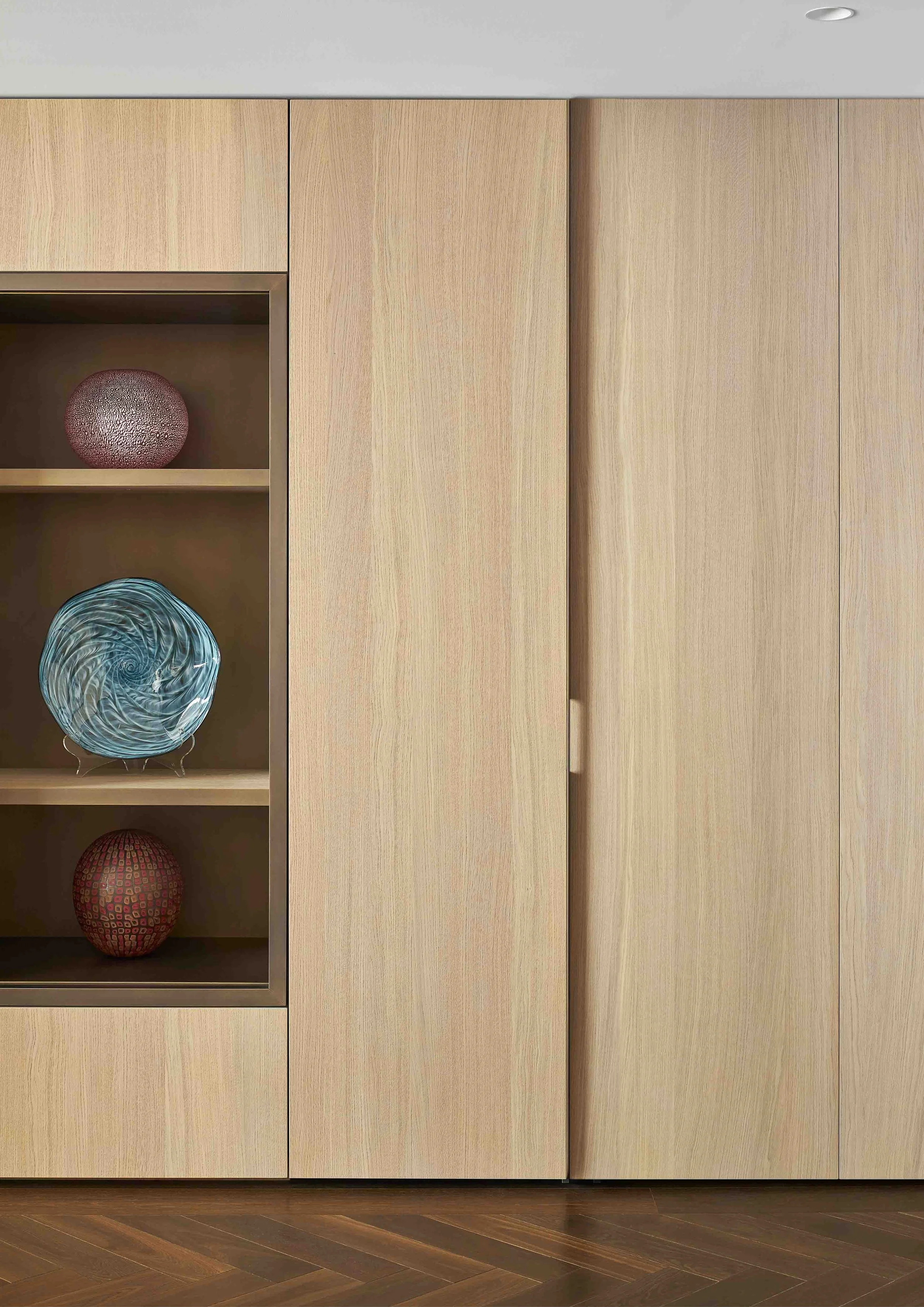
Watch The Local Project, Herne Bay House —With outdoor terraces behind and in front, the kitchen needed to feel inclusive of these areas and provide a visual consistency between them all. Apertures were punched into the cabinetry to provide 'look through' moments to connect to these outdoor spaces. Aged brass shadow boxes were integrated into the cabinetry to provide relief and an opportunity to celebrate the owner's collection of glass sculptures.

Inspired by ideas of integration and concealment.By separating the functions of the kitchen into three; bar, fridges, kitchen, it meant the space could become highly reactive. While entertaining, this separation allows the space to function effortlessly under high intensity use. Pocket doors enable the more functional aspects of the kitchen to be concealed when not in use. This means that the clients have the ability to shut down or reveal as much of the daily workings of the kitchen as required. By closing down these functional areas, the space then recedes, feeling intimate again.
With concealment being central to the design concept, it was important that this could be achieved elegantly. The integrated fridge, freezer and wine columns are able to disappear seamlessly into the timber cabinetry. Recessing the induction hob allows for a level surface which acts as a functional bench space between the indoor and outdoor kitchens. The spaces were considered as a whole, to ensure that the functions of the living spaces didn’t compete with each other and instead a sense of consistency and considered detail was achieved.

While there were many aspects of the existing design that were flawed, its central vaulted living area provided a generous sense of scale. Within this space, a cantilevered steel staircase was designed to connect to the master suite above. In continuing the theme of the space below, a steel screen was designed to delicately conceal the functional routines of the home.
The transformation from tired and uninspired has become an elegant and refined, home away from home.Next Project
Architecture and Interior Design:
Oli Booth Architecture
Interior Styling and Selections: James Peters
Builder: Barrett Co
Photographer: Simon Wilson


