Poppas Palace
Carved into an unlikely corner of Tāmaki Makaurau, this determinedly clear-eyed design pushes the boundaries – and wins. “This project creates an intergenerational view of how a family can stay together and keep their space and sanity. It is cleverly organised, detailed and sensitively engages with a shared garden. A humble and smart home, it’s the type of architecture that should be applauded in our cities.” Sarosh Mulla, rōpū
All words by Simon Farrell-Green – Issue 21, Here MagazineGrey Lynn, Auckland
New Zealand–
AwardsHere: Best House Aotearoa 2023
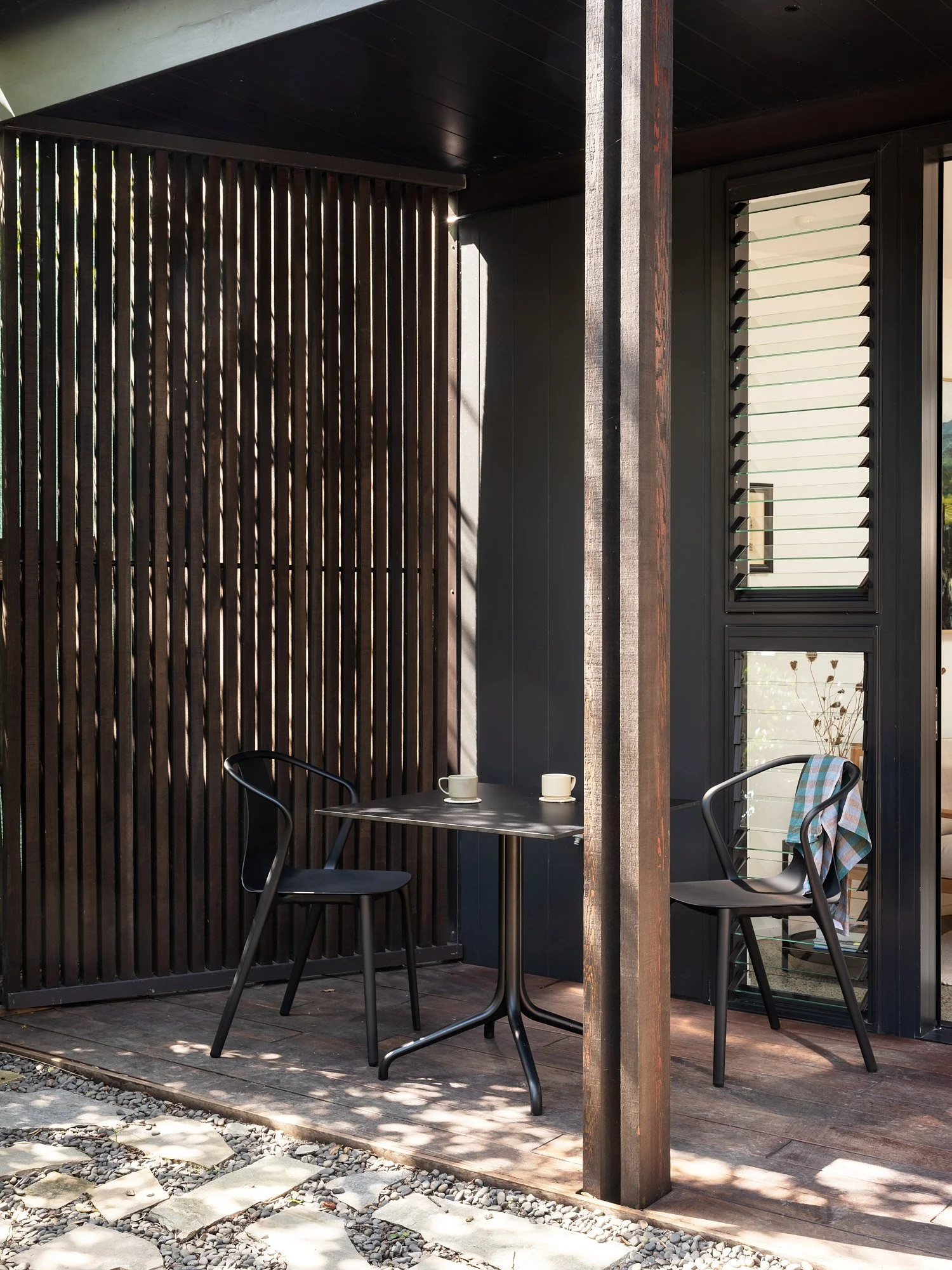
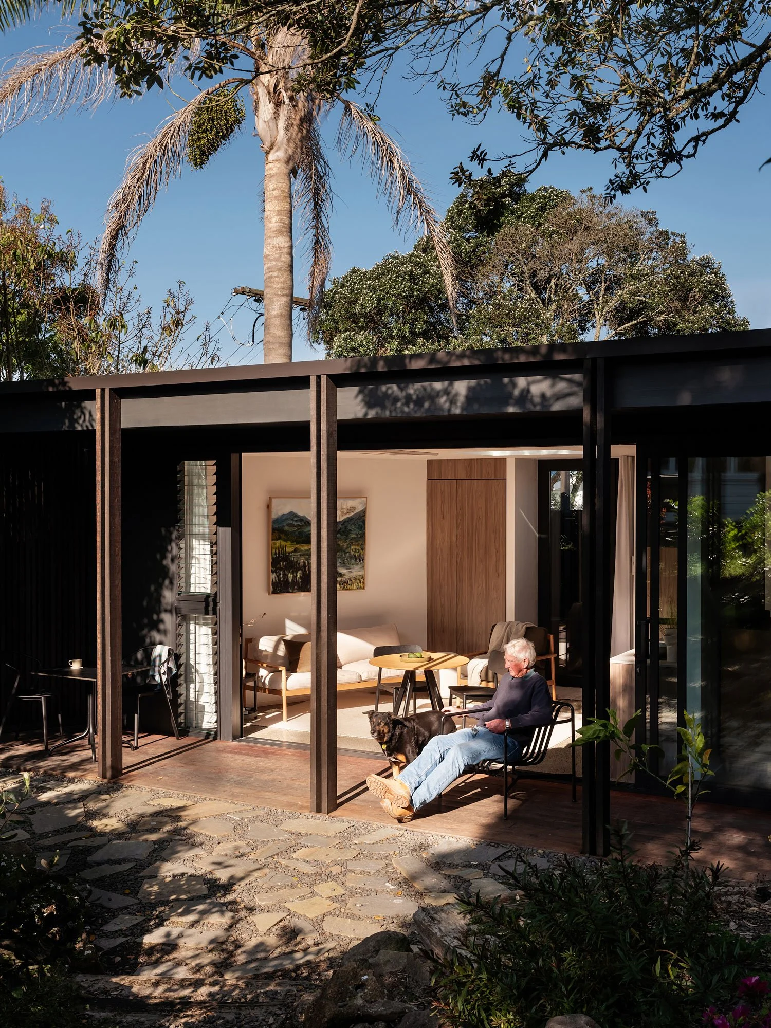
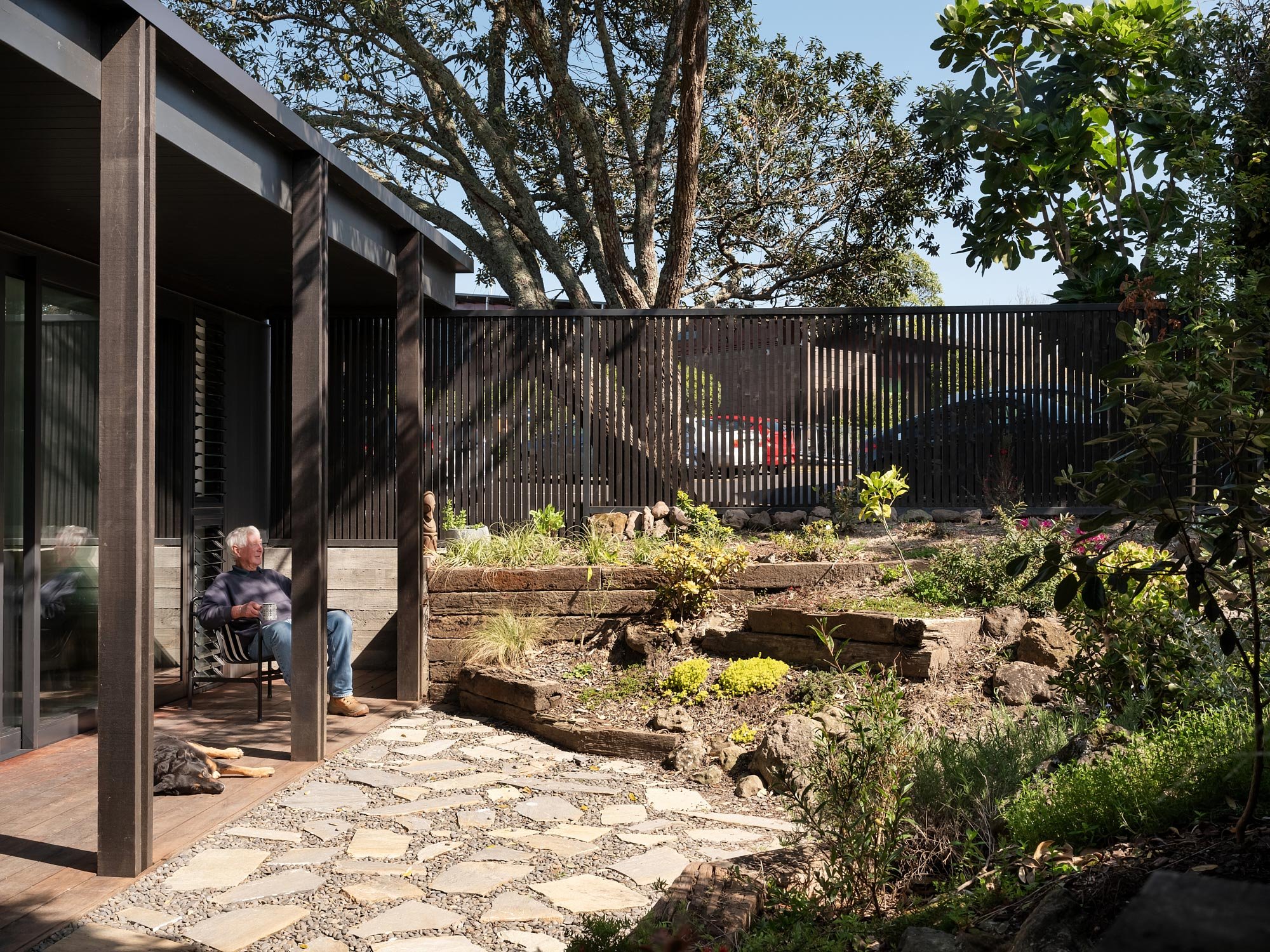
Here: Density On Sundays, the Grey Lynn Farmers Market pops up in the community centre on Richmond Road in Tāmaki Makaurau, and the normally quiet carpark is rammed with EVs and a couple of food trucks. The smells and sounds of the market – including a folk group who play on the deck – waft across the tarmac to the front verandah of Pete Hole’s home, where he and his dog Sheba can usually be found in the sun with a cup of tea and a crossword. “Some mornings I’d pay good money not to have them play,” he says, laughing, only half serious. “When the fence wasn’t there, people used to stop and have a conversation. A lot of people pass good comments about the place.”
It’s not surprising, since there is poetry in Pete’s little house, which occupies a scrap of land behind the 1900s villa owned by his daughter Kate and her husband Paul. It was designed by their family friend Oli Booth whose parents and Pete go way back – Oli’s known Pete since he was a kid. “It was such a delight to be able to design a house for Pete,” says Oli. “It was just such a special project.”
Conversation about building something here started about five or six years ago. Back then, Pete was based in Vanuatu where he’d lived for 20-odd years, practising as a vet on the island of Santo. When his circumstances changed, he started to think about coming home to be closer to family, and this little spot seemed to offer an opportunity.
Bounded by the carpark, a small pedestrian lane, a neighbour, and a concrete power pole owned by Chorus which no one quite understands the purpose of but which cannot be removed, the house is small – a sort of trapezoidal shape, narrowing as the section does, and wider at its mouth. It sits below the main house, on the south side, and shares its 685-square-metre section. Technically, it’s a minor dwelling, though it’s more than a sleepout or studio, and functions entirely separately, right down to having its own access onto the lane through a small courtyard and an elegant black steel-and-cedar gate.
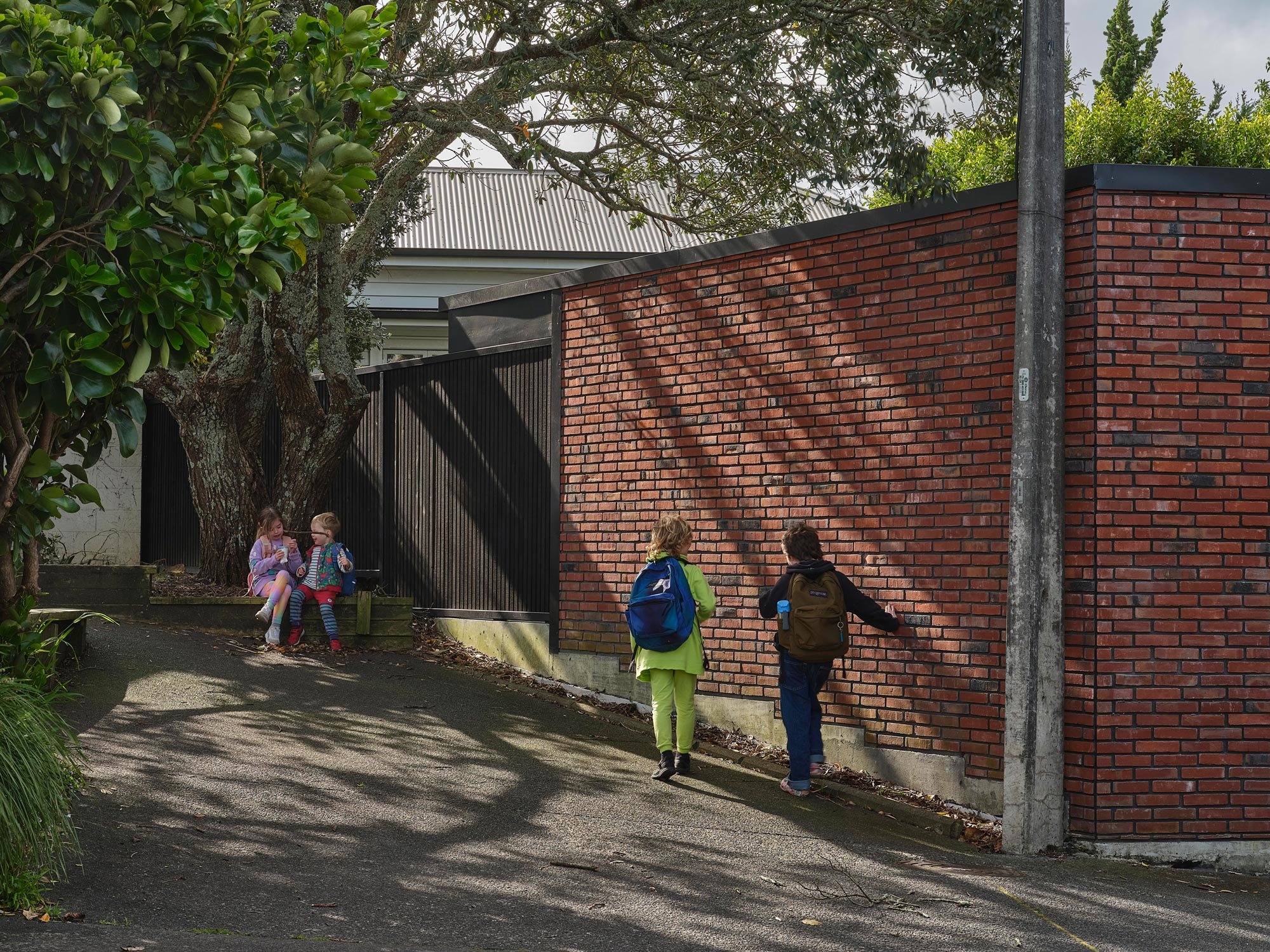
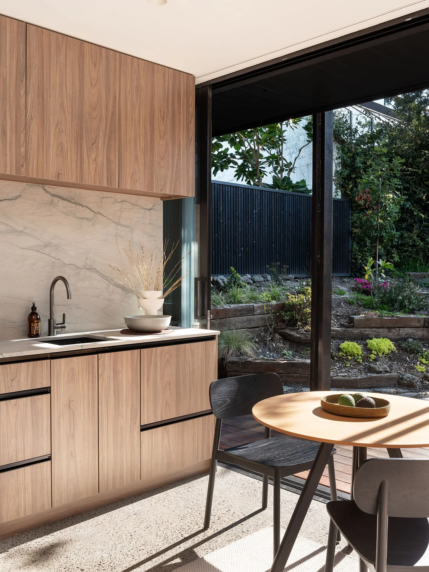
Inside that frame, Oli devised an elegantly simple scheme in which spines of cabinetry bisect the plan on two axes. One runs across the width of the building and contains utilities, pantry, fridge and bedroom wardrobe. The other spans its length, containing the kitchen and running into the bathroom. The spaces sit naturally, flowing out to the front verandah, and there is only one internal door, to the bathroom. It’s a kind of game of Tetris, squeezing functional spaces into an awkward shape, without making them feel compromised. “They’re obviously reactive to the shape,” he says of the rooms. “It’s just two lines through the house and the rest is furniture.”
His approach was clear-eyed, deftly simple, turning the many and varied constraints of the site into virtues. The trapezoidal shape of the land became the shape of the house – a brick frame, accessing the lane via a small courtyard and completely open to the garden on the north side through generous walls of floor-to-ceiling sliders.
Remarkably, the council approved the plan with no changes. “I think they could just see that it made sense despite breaking all the rules,” says Oli simply. It helped that there was public space on two sides, and the villa sits on the very edge of the residential zone, with a tall commercial building to the west; I suspect it also helps that it’s a very beautiful scheme – the thinking is clear in the plans.
The process was sped up somewhat after Pete broke his leg badly and was airlifted out of Vanuatu back to New Zealand. “I came out horizontal on a Learjet,” he says. “There was no champagne, and I had a nurse instead of a stewardess.” After a month or so in hospital, not long after the country came out of lockdown, he moved in with Kate and Paul. Eighteen months later, he shifted into his new home.

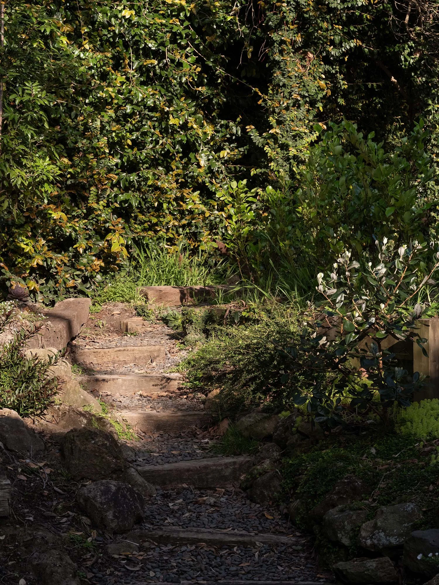
Remarkably, this little house was built for a touch less than $400,000. Part of that is driven by its size – 52 square metres, including verandah – and partly it’s down to the materials. The floor is polished concrete and the cabinetry is melamine, though Pete recently up-specced that with a stone kitchen bench and splashback that were going spare. The bricks were leftovers too, and Pete, Paul and Kate did all the landscaping. The rocks that form the garden walls came from Pete’s friend Rosemary in Whangārei. Pete drove the van and another old friend, Jean, loaded up the rocks using a Kubota tractor with a scoop on the front.
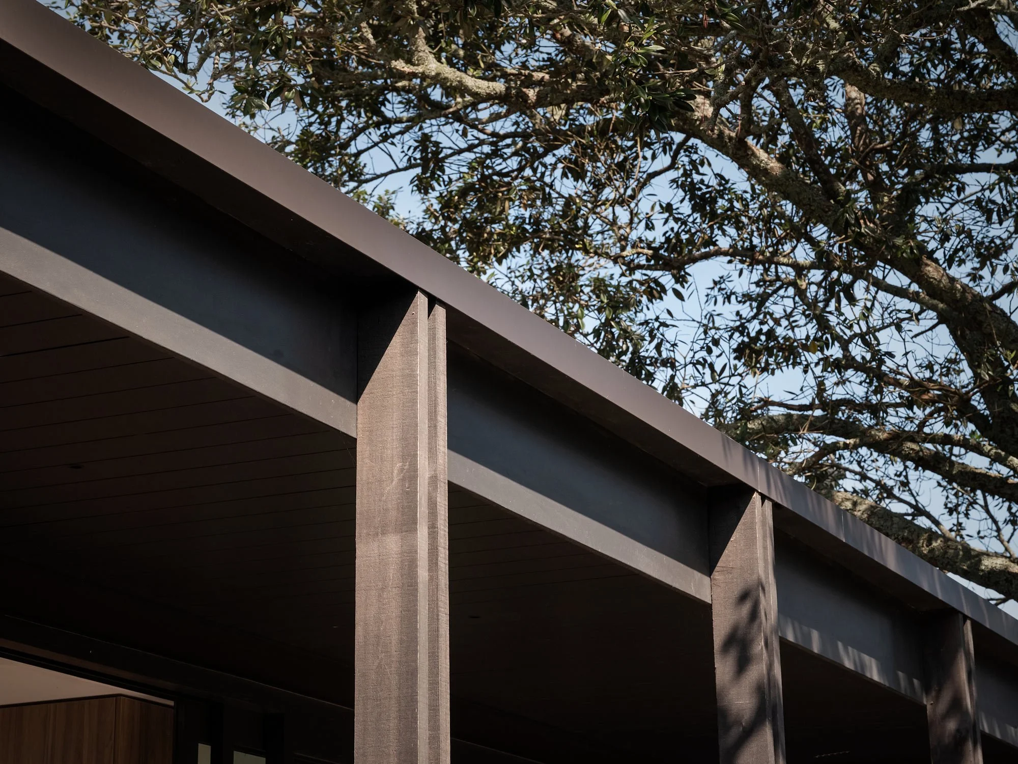
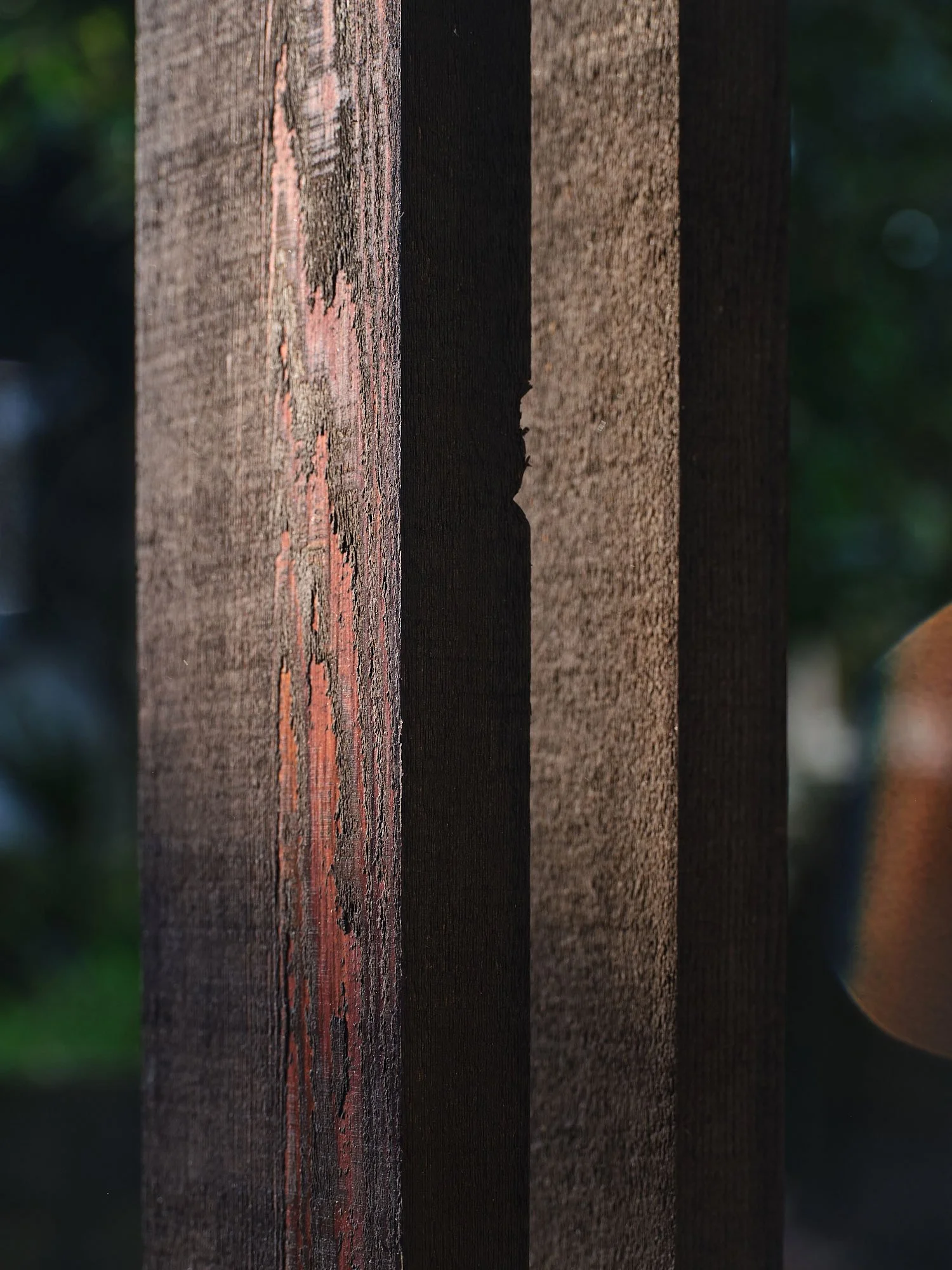
The genius of Oli’s design is that it takes these standard materials and makes them sing with beautifully realised details and moments. It also leaves money for the things that count, such as a steel portal frame that eliminates the need for any posts along the front of the house. Here, sliders run floor to ceiling, and the wall between the kitchen and bedroom is slightly stepped back, so the doors can slide in front of it, pushing away completely from the living area. Similarly, the verandah is cantilevered from the side walls (meaning there are no posts on the corners; another fire-rating consideration), supported lightly by slender doubled cedar posts.
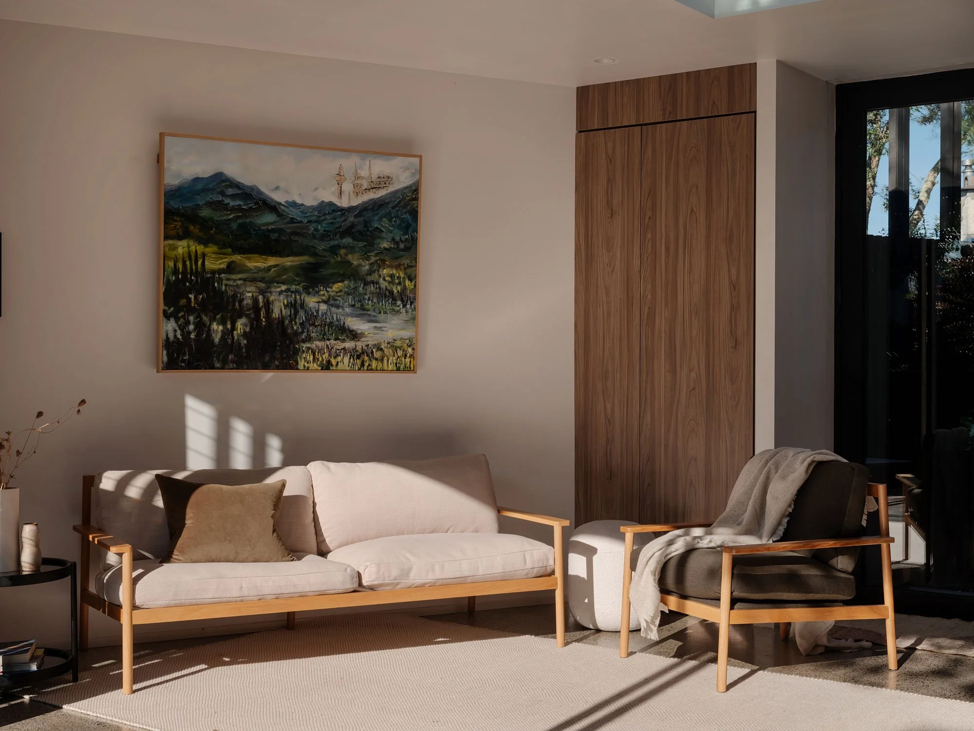
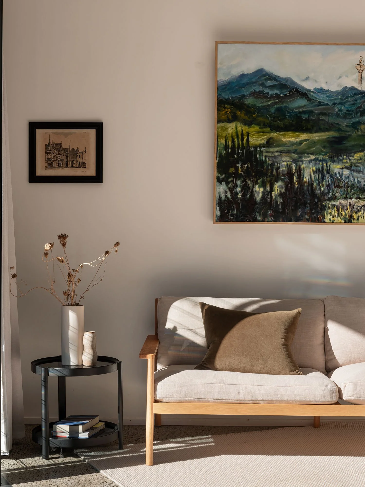
Inside, it feels generous and airy. Two large skylights make up for the lack of windows on the boundary walls. Finding a spot for them that sat away from the firewalls was something of a story in itself. The stud height is taller than average at 2.6 metres, reaching up to 3.1 metres inside the skylights.
These are things you don’t normally see in affordable architecture, where the go-to solution is to design something more standard that fits with the building code. But when buildings get small – and when they have to fit into forgotten scraps of land in strange corners of our cities – poetry becomes even more important. What Poppa’s Palace shows you is that poetry doesn’t come from the finishing touches: it comes from the thinking.
Next Project
Architecture: Oli Booth Architecture
Interior Design: Oli Booth Architecture
Styling: Citta
Builder: RB Builds
Landscape Designer: Poppa Pete
Photographer: Sam Hartnett, Petra Leary


